
For years, web designers and developers have chased the elusive dream of pixel-perfect layouts—interfaces that look identical on every screen, every time. It was a noble pursuit, but as technology evolved and devices multiplied, the dream began to crumble. What looked flawless on a 1080p monitor might break on a 4K screen, stretch on a tablet, or collapse on a phone.
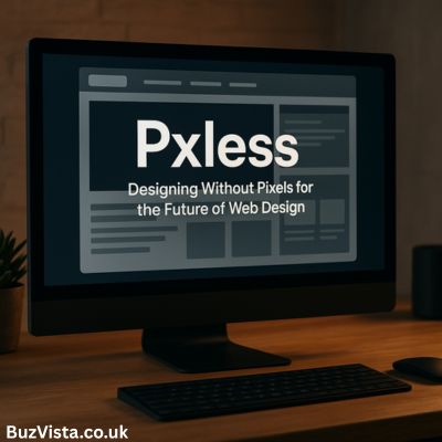
In today’s digital landscape, where screen sizes, resolutions, and user preferences are infinitely varied, the idea of perfection measured in pixels has become outdated. Out of this realization emerges a new design philosophy: Pxless.
Pxless doesn’t mean abandoning precision. Instead, it’s about redefining it—creating designs that are flexible, accessible, and naturally responsive to context. It’s a shift from designing for screens to designing for experiences.
The Meaning Behind Pxless
The concept of being pxless—literally “without pixels”—challenges one of the oldest habits in web design: using fixed pixel values for everything. In traditional workflows, designers would define widths, margins, and font sizes in exact pixels, expecting them to look uniform across devices.
Pxless breaks free from that rigidity. It replaces fixed pixel values with relative units like rem, em, %, vw, and vh, allowing elements to scale proportionally. Rather than locking your design to one screen width, pxless design embraces fluidity—components adapt gracefully to whatever space they occupy.
This approach is not just a technique. It’s a mindset that favors adaptability over control, consistency over rigidity, and user experience over visual exactness.
Why the Pixel-Perfect Era Is Fading
The move away from pixels isn’t about aesthetics; it’s about survival in a diverse digital world.
Once upon a time, designers worked within predictable boundaries. Websites were viewed mostly on desktop monitors, and a “standard” resolution actually existed. But with the arrival of smartphones, tablets, smart TVs, watches, and even foldable devices, the idea of a universal pixel grid dissolved.
What was once stable is now infinite.
When a design relies heavily on fixed pixel values, several issues arise:
- It breaks across devices. What fits perfectly on one screen might overflow or shrink elsewhere.
- It hinders accessibility. Users who zoom in or change font sizes often break pixel-based layouts.
- It increases maintenance. Every new device or breakpoint demands new adjustments and CSS fixes.
- It limits the future. New display technologies—from ultra-wide monitors to AR interfaces—demand designs that can bend, not break.
Pxless design, by contrast, is fluid by nature. It doesn’t try to force every layout into uniformity—it allows each environment to shape how the content is presented, while maintaining a consistent hierarchy and rhythm.
The Philosophy of Flexibility
At its heart, pxless design is about creating systems, not static pages.
When you define your design in relative terms—say, using rem for typography or percentages for container widths—you’re teaching your layout how to respond intelligently. It learns to “breathe.”
Imagine typography that expands gently on larger screens, or layouts that rearrange themselves smoothly without the need for dozens of hard-coded media queries. That’s pxless design in motion—dynamic, natural, and human-friendly.
Instead of obsessing over whether a button is exactly 42 pixels tall, pxless design asks, Does it look balanced in this context? Does it feel proportionate, legible, and accessible?
That’s a far healthier metric of good design in today’s web ecosystem.
How Pxless Works in Practice
To understand how pxless design comes to life, it helps to break down its main elements—each one replacing an old pixel-based habit with a more flexible alternative.
1. Relative Units
In pxless design, typography, spacing, and layout are built using scalable units.
remrelates to the root font size.emrelates to the parent element.%adjusts according to container size.vwandvhrespond to the viewport’s width and height.
The result? A design that feels alive. As users resize their windows or switch devices, the interface naturally adjusts itself—without breaking its balance.
2. Fluid Layouts
Gone are the days of setting containers to “1200px wide.” Pxless favors Flexbox, CSS Grid, and percentage-based widths, so designs stretch or shrink based on available space. You might give your main container a width of 90% and a max-width limit to maintain comfort on wide screens.
Everything flows and rearranges elegantly, like water adapting to its vessel.
3. Design Tokens
Another key pillar of pxless design is the use of design tokens—global values that define consistent spacing, font scales, and colors across the interface. These tokens, often expressed in rem, create harmony. If you adjust one base value, every element updates proportionally.
That’s system thinking in action.
4. Container Queries
Pxless also benefits from the rise of container queries—a modern CSS feature that allows components to adapt based on the width of their parent containers, not just the overall screen size. Each element becomes smarter and more independent, adjusting itself within different layouts.
This means fewer media queries, fewer overrides, and more modular, reusable design.
Benefits That Matter
The appeal of pxless design isn’t just theoretical—it’s deeply practical. Here’s what makes it worth the shift:
- Cross-Device Harmony
Pxless designs maintain visual proportion on any screen, from phones to TVs. - Built-in Accessibility
Users who zoom or scale text will still enjoy readable, well-structured layouts. - Easier Maintenance
Fewer breakpoints and CSS overrides mean cleaner, leaner stylesheets. - Future-Proof Architecture
Pxless is naturally ready for any new device, regardless of its size or resolution. - Consistency Through Tokens
Shared design tokens ensure that all elements maintain the same rhythm and feel. - Performance Gains
With simpler, more modular CSS, loading and rendering times often improve.
In short: pxless makes your design lighter, faster, and far more resilient.
The Challenges Along the Way
No philosophy comes without its hurdles. Going pxless can feel like unlearning old habits.
Designers and developers might initially struggle with layouts that scale “too much” or typography that feels inconsistent. The key is balance—setting minimums and maximums with CSS functions like clamp() to create flexible yet controlled scaling.
Testing also becomes more essential. Because pxless design is inherently fluid, teams must test across various screen sizes and accessibility modes to ensure harmony everywhere.
Documentation is equally important. Without clear standards, teams might interpret relative units differently. A shared design system or token reference helps maintain cohesion.
Yet these challenges are small prices to pay for the benefits gained. Once mastered, pxless design feels liberating—like breathing fresh air after years of pixel grids.
From Pixels to Proportions: A Mental Shift
Perhaps the hardest part of going pxless isn’t technical—it’s psychological.
For decades, designers have been trained to think in pixels, to measure everything to the decimal. The pxless approach invites us to trust the browser, the device, and the user. It asks us to prioritize relationships over numbers, flow over formality.
In many ways, pxless represents a more human design philosophy. It acknowledges that users are not machines—they zoom, resize, scroll, and view content in unpredictable ways. Our job is not to restrain that behavior but to accommodate it gracefully.
When you start thinking pxlessly, you stop seeing screens as fixed canvases and start viewing them as living spaces that adapt and evolve.
The Road to Implementation
Transitioning to pxless design doesn’t require a total rebuild. You can evolve gradually.
Start by converting typography to rem units and setting a global scale. Then replace fixed paddings and margins with tokens defined in relative terms. As you modernize your layout, incorporate CSS Grid and Flexbox. Over time, you’ll find that the need for multiple breakpoints disappears—your layout will simply flow.
Container queries can come next, enabling components to adapt in a modular way. Eventually, your entire design system becomes self-sustaining—scalable by design.
The key is iteration: one step at a time, one layer at a time. The pxless philosophy rewards patience and attention to detail.
A Look Toward the Future
The future of web design is undeniably pxless. As CSS evolves, more tools are being introduced to support fluid design, from advanced functions like clamp() to full browser support for container queries.
Meanwhile, accessibility standards and user expectations are rising. People expect interfaces that work everywhere—on any device, in any condition. Rigid, pixel-based systems can’t keep up.
Pxless design isn’t a passing trend. It’s the natural evolution of responsive design—a future-proof philosophy for building adaptable, inclusive, and enduring digital experiences.
Final Thoughts
In an age of infinite screens, designing with fixed pixels is like drawing in sand—it looks perfect for a moment, until the tide comes in.
The pxless approach offers something better: flexibility without chaos, consistency without confinement. It’s a design philosophy that moves with time, technology, and the user.
By going pxless, we’re not giving up control—we’re learning to share it with the environment our designs live in. And that’s the essence of true responsiveness.
For more in-depth insights, tutorials, and stories on modern design and web development, visit Buz Vista, where ideas about the future of the web come to life.